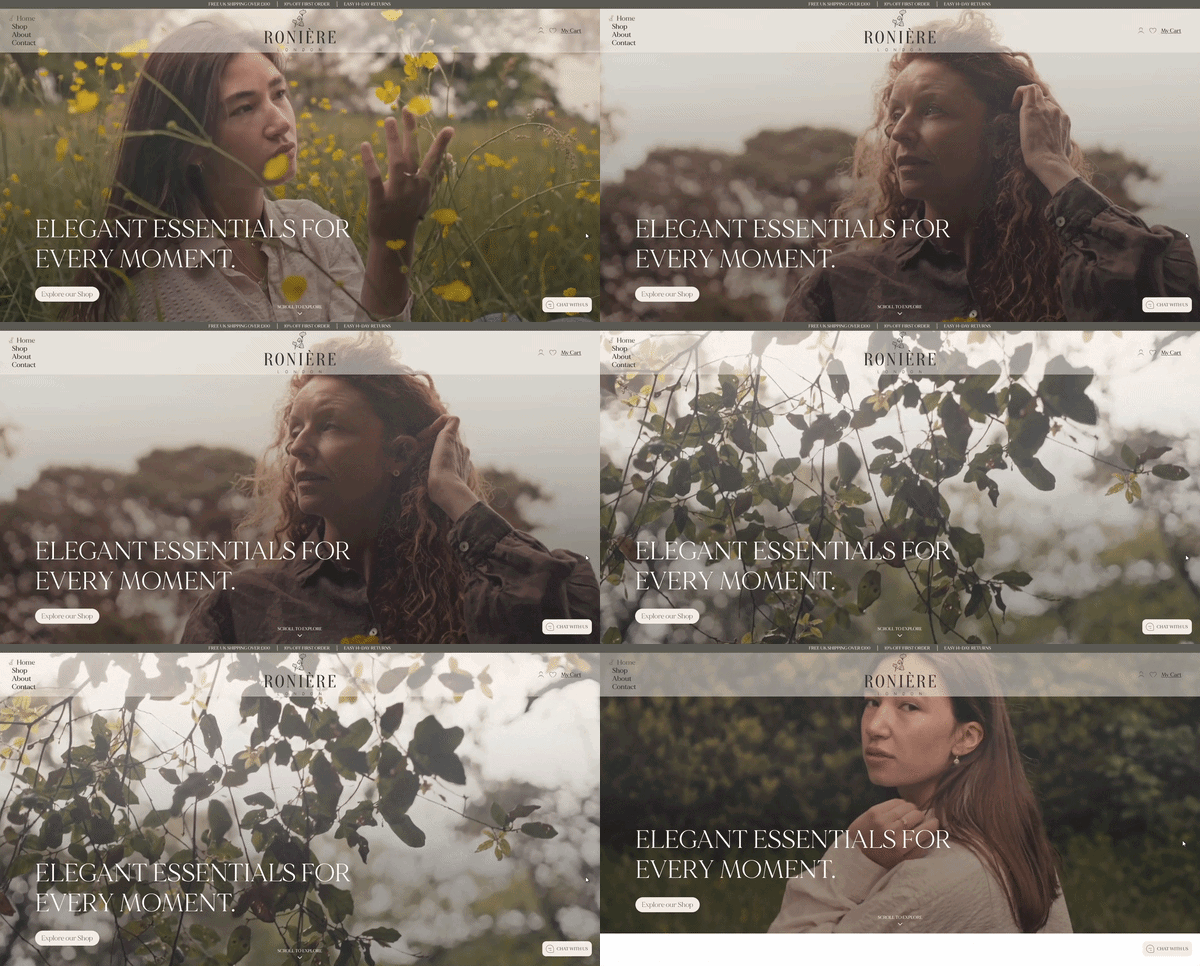
01 Problem
What was not working
People were interested enough to start the journey, but many went quiet once pricing came up. The team assumed the price itself was the problem, but the page gave users very little context before asking them to make a decision. The design was creating price shock instead of helping users understand the value first.
02 What we found
The real issue
The issue was not just price. It was timing, trust, and hierarchy. Users needed to understand what they were getting, what happened next, and why the offer was worth considering before the price appeared. The part needing attention was the decision path before the price.
03 The fix
What we changed
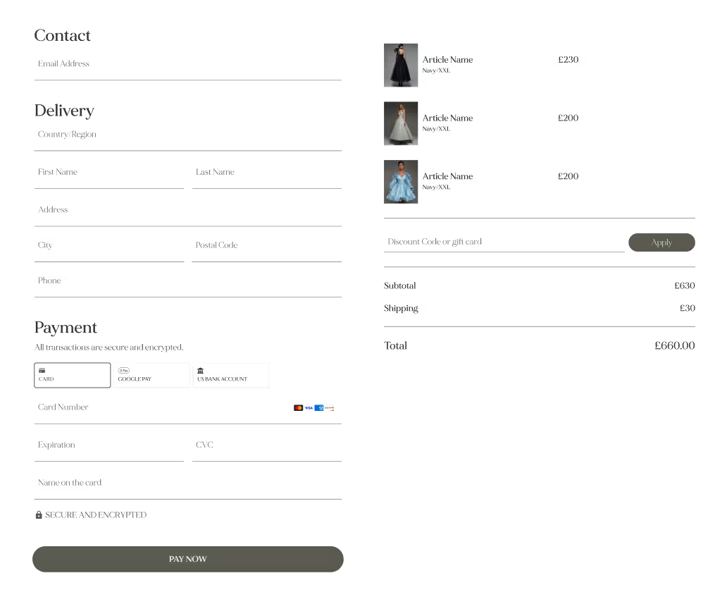
We redesigned the page around the user’s decision process: value first, proof second, price third. We made the offer easier to compare, moved trust points closer to the action, and reduced the amount of back-and-forth needed before booking. We also suggested an A/B test between showing the price earlier in the page versus after proof, so the team could measure which version created more completed bookings.
04 What we built
The outcome
A clearer pricing journey that made users feel informed before they reached the decision point.
05 Result
After the redesign, Roniére London saw booking completion improve from 28% to 39% over the next few weeks, without changing the actual price.